Global weather comparisons
Motivation
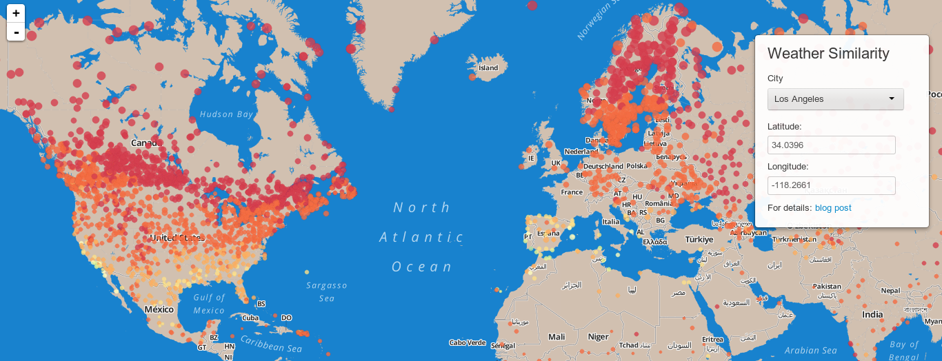
I recently built a tool for calculating and interactively displaying the similarity between climates around the world. I was particularly interested in this question: what are the farthest cities from my current city that experience a similar climate throughout the year? To be precise, I wanted to know what cities experience a similar sequence of weather throughout a year. I did not want the results to be limited to hemisphere; I wanted the results to be irrespective of phase of seasons so that climates in North America, for instance, could be directly compared with climates in South America or Australia.
You can access the app at UPDATE: sorry, this app has been retired as of 8-27-2016 to make room for other projects.
Rough outline of methods
- Downloaded daily weather data from the NOAA GHCND database.
- Filtered for min temperature, max temperature, and precipitation data.
- Filtered out any stations without at least 50 years of these 3 data types. Ended up with about 25,000 weather stations.
- Averaged data over all years to end up with an average year sequence for each station.
- Shifted all data so that the hottest day of the year was the first day, in order to align the seasons.
- Calculated three similarity matrices for the min temperature, max temperature, and precipitation data.
- Saved these matrices as bigmemory objects.
- Developed R Shiny app with leaflet and Mapbox to display results.
- Uploaded and served from a DigitalOcean droplet running Shiny Server.
bigmemory was essential
Due to the size of the data set, it wasn’t feasible to calculate similarity on the fly. Therefore I looked for some way of storing the data set that would allow me to quickly take a subset for only the current city. The binary RData format is space-efficient, but cannot be sliced without loading the whole object into memory, and each of the similarity matrices is >5 GB. I also experimented with setting up a simple SQLite database using the RSQLite package, but found the query speed unusably slow (>0.5 sec), even with what I think was proper indexing. I finally landed on the bigmemory package. I found the file sizes quite large – possibly almost 50 times larger than RData binary format – but bigmemory was exceptionally easy to setup, and most importantly for this application, very quick (<0.01 sec) to access slices of large datasets.
Why I selected only min temp, max temp, and precipitation
While I really would have liked to include features such as humidity, I found quite a few misformatted entries for data types other than temperature and precipitation. And perhaps more importantly, these three were the most parsimonious and I found that more than 25,000 stations had these entries.
How the Shiny app works
The app takes a latitude and longitude as input. These can be provided by clicking on any of the already plotted station locations, selecting a city from the drop-down, or manually by entering them into the textboxes. It calculates the distance from that desired lat/long to all stations. It then takes the closest station and retrieves (from bigmemory objects) the max temp, min temp, and precipitation similarities between this station and all others. From those 3 data sources it calculates a total similarity score which is currently just a weighted sum:
similarity = w_1 * sum(min_temp_differences) + w_2 * sum(max_temp_differences) + w_3 * sum(precipitation_differences)
Finally, to make the app lighter and more responsive, it places location markers for only a random sample of a few thousand stations, colored by their similarity to the selected station.
Results
I am still in the process of testing whether the metric is qualitatively accurate and I would definitely appreciate feedback. That said, one of my motivating questions was whether a similarity score like this could recapitulate the climates that are ideal for growing grapes and producing wine. If you click on a circle just north of San Francisco in Napa or Sonoma county, you will find indeed similar scores shown in the mediterranean, South Africa and southern Australia. I take that as a very very rough and preliminary measure of progress. On my to-do list is evaluating deserts and tropical locations.
Work in progress
This app is definitely still a work in progress. On the top of my list of things to fix is how drastically the color scale can change depending on the sampling that is performed (each time you zoom in and out or change stations). I think I need to set the color based on the log of the similarity score and also set limits for the score to avoid outlier effects. I will also explore ways to increase the number of stations sampled. I’m currently only showing about 20% of the total because even on modern hardware, when more than 30% of the stations are added it becomes very sluggish to scroll around the map.
Other work in this area
Before I started building this, I did a search for earlier work. Iain Dunning pursued a similar question and built an app comparing Australian climate to cities in the US, albeit without a map interface. Iain’s app is nicely built on Bootstrap and returns a list of the most similar cities in the opposite country. Another web-based tool was also built on NOAA data to return a graph comparing several selected US cities.
You can access the app at http://apps.calgorithms.com/weather/.